
Merchant Dashboard for NuORDER B2B
Enhancing clarity during the onboarding process for new buyers.


Overview
The NuORDER B2B merchant dashboard empowers new platform buyers with enhanced clarity and a streamlined onboarding process. These improvements feature a comprehensive setup guide for crucial workflows, facilitating a seamless transition into self-serve ordering. Additionally, we've added a section for guided videos, enhanced clarity within the connection panel, and quick access links to our help centre articles. These enhancements were pivotal in onboarding Lightspeed merchants onto the platform, significantly enhancing buyer usability.
Background
To enable new buyers to initiate their ordering journey on our platform, a series of essential steps must be taken prior to their interaction with brands and order placement. Historically, when buyers gained access to the platform, they found themselves on the dashboard without clear guidance on the next steps or where to navigate. This resulted in an initial negative customer experience, affecting their trust in our system. In recognition of this, we aimed to enhance the onboarding process for buyers before implementing the Lightspeed POS sign-up flow, thereby anticipating a higher customer adoption rate.
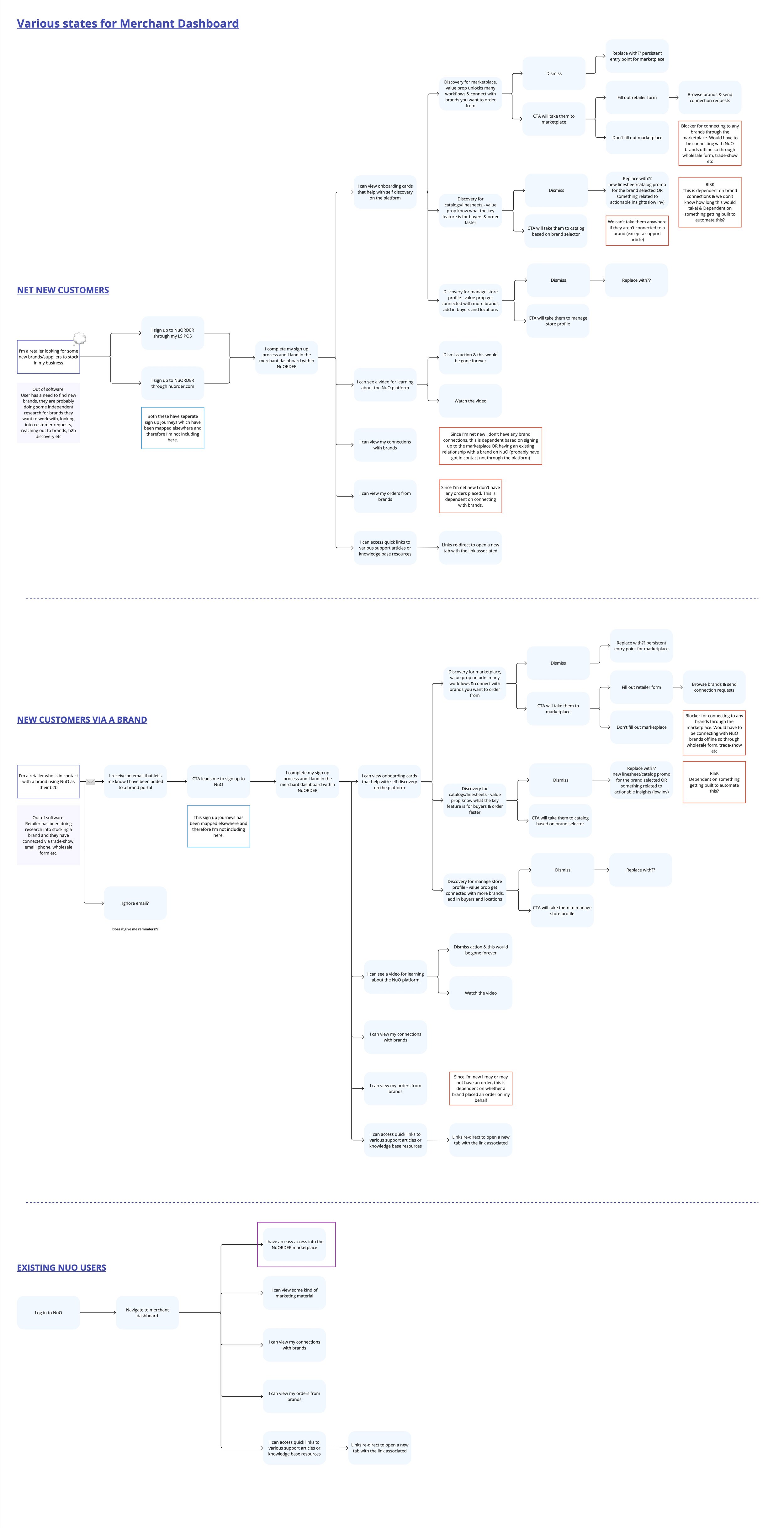
Onboarding to a new platform is overwhelming…
How might we empower new NuORDER buyers to confidently engage in self-service upon gaining platform access?
Previously, users would land on a dashboard with empty states

Lack of clear guidance in empty states
The absence of clear instructions in the empty states leaves retailers uncertain about how to connect with brands. To initiate this process, retailers must set up a retailer profile to request brands within the marketplace. Once connected, they gain the ability to place orders.
Undiscovered help centre
Some of our buyers are unaware of the existence of the help center, as there are no links directing them to it. This knowledge gap impedes their ability to access valuable resources for support.
Over-reliance on brand assistance
Buyers frequently seek assistance from the brands, resulting in increased demands on our paying customers who must invest extra time troubleshooting NuORDER on behalf of their clients. This impacts both the efficiency and satisfaction of our users.
Usability challenges with connected brands section
The usability of the connected brands section is suboptimal, causing confusion among buyers about the status of their requests. Improving the clarity and functionality of this portal is essential to enhance the user experience.
Under-utilized marketplace promo
The marketplace promo occupies a significant amount of space but does not serve as an effective entry point. It lacks engagement and interactivity, and thus, does not entice users to explore the marketplace. Rethinking its design and content is essential to maximize its impact.
Users and audience
New buyers to NuORDER, as they onboard onto the NuORDER platform for the first time, often juggle multiple B2B platforms, making it overwhelming to adapt to each one's unique experience and usability. These newcomers may arrive through various channels like nuorder.com, brand invitations, or our integration with Lightspeed POS. A proper setup within the platform is essential, as any misconfiguration may deter them from returning to place orders. In such cases, they might opt to rely on sales representatives or even bypass NuORDER altogether, resulting in missed sales opportunities.
Roles and responsibilities
My role in this feature was the Product Designer, owning the end to end user experience and design. I worked closely with the Product Manager in the problem discovery space to do user research, understand assumptions and risks and what is the impact we were hoping for. Additionally, I worked closely with the lead engineer on the solution discovery and delivery for any tech limitations, helping in dev support for new components, testing and making sure the end to end delivery was polished.
Scope and constraints
We divided this project into two cycles. In the first cycle, our primary focus was on achieving quick wins, which involved enhancing the user-friendliness of the connection request section and doing some back-end services for the setup guide. During the second cycle, we placed a more significant emphasis on the setup guide, integrating videos and ensuring its responsiveness. Several challenges arose during this process. As a newly formed team for the NuORDER platform, we needed to familiarize ourselves with the problem space, design patterns, and the codebase. Notably, NuORDER lacked a standardized design system, which required us to build a significant portion of the frontend from scratch while incorporating existing app patterns to maintain consistency.
Understanding the problem
Before plunging headfirst into the design phase, our approach involved gaining insights into the buyer experience with the existing onboarding process. We achieved this by conducting interviews with recently onboarded buyers to understand their initial encounters. Simultaneously, we sought to identify any issues brands encountered when introducing their clientele to NuORDER. Moreover, we engaged in numerous interviews with internal stakeholders, including customer support and members of other product teams who possessed a deeper familiarity with the platform, given our newness to it.
Furthermore, I conducted a comprehensive design audit of the current user experience, which provided me with a clear understanding of the usability aspects in need of improvement.

Pain Points

I mapped out the current onboarding experience which helped identify pain points and opportunities.
Merchants enter the platform without any clear guidance on their next steps.
Recognizing the need for improvement, we aimed to enhance the onboarding process to expand our B2B network, particularly by welcoming Lightspeed (LS) merchants. Addressing this issue was crucial, as the existing experience fell short of ensuring customer retention.
“Yeah, there wasn’t much onboarding. I mean we didn’t have any help from NuORDER vendors to do this. And then we started looking at it and I would pull it up a couple times and close it, I’d say it wasn’t as user-friendly, it wasn’t as efficient.”
Merchants lack clarity on how to access platform support, and the current user experience lacks the necessary intuitiveness.
To ensure a positive customer experience and elevate our buyer NPS scores, it's imperative that we empower them with the tools and resources needed for self-serve ordering on the platform, reducing their reliance on sales representatives.
“Yeah, it was just exploring on my own. Honestly. I didn’t know that there was a support system for NuORDER. It probably would be helpful for me to have had that so I could say, what are all these icons on the left hand of my page? What does each one do? I know what the line sheets are, I know what the orders are. But that’s all I ever use.”
Opportunities
During our discovery phase, we identified several opportunities, but we recognized that the most significant impact on our buyers would come from providing support right within the dashboard – their initial point of contact. Our objective was to create a comprehensive, step-by-step guide that would seamlessly walk them through all the essential steps to successfully onboard onto the platform.
Wireframes
I created some quick sketches which I translated into some low-fidelity wireframes, this helped understand the information architecture and the data points needed for the form.


A pivotal aspect of this process was crafting the content for each section, which hinged on comprehending the interrelationship between the steps and pinpointing the completion criteria for each.
Designs
At the culmination of the cycle, we introduced the newly enhanced dashboard to all users. The designs were an evolution of NuORDER's existing look and feel, incorporating elements and styling from our forthcoming tokens. Our design approach prioritized scalability, allowing for the easy addition or removal of steps as we continued to learn. This adaptable pattern was intended for broader application within the app, particularly in areas requiring specialized onboarding.
We developed the overall dashboard with modularity in mind, making it conducive for feature-specific onboarding and the integration of marketing materials to support our Lightspeed discovery initiative.
Outcomes
Since this is a recent release, we are actively in the process of gauging its impact and success by leveraging metrics and conducting customer interviews.
Software
Figma, Miro